My blog has moved!
You should be automatically redirected in 5 seconds. If not, visit redirectLink" href='http://chateauandbungalow.wordpress.com/'> http://chateauandbungalow.wordpress.com and update your bookmarks.


Tuesday, August 31, 2010

Jill Malek Wallpaper

I was recently introduced to the amazing wallpapers of Jill Malek by Michael Valvo of Design Newport (I sat down with he and his business partner, Stella Martin, this past weekend for an interview for Newport Patch which I'll be sharing with you soon). Malek is a talented artist who creates staitionery, packaging, and textiles as well as hand-screened wallpaper, my personal favorite of her works. The gold fish on a red background, also known as the Betta print, is stunning both graphically and texturally. It would be fabulous in an entry or a dining room.

I also love the Anemone Wallpaper which has a subtle quality to it, but is still so visually exciting. I would love this in a living room or bedroom.

And there is something calming about the use of gingko leaves for the Maidenhair Wallpaper even though they are placed in a somewhat chaotic fashion. This screams bedroom to me. It seems that people of my generation still think wallpaper is so stuffy and something our grandmothers did or our mothers did when they were in a phase. I'd say that I used to think that way too, but there are so many unbelievably gorgeous wallpapers out there. We have become such a society of needing instant gratification, and while paint is easy to re-do when you get bored of the color, these great wallpapers show that you can commit to your style and I don't think you'll regret it. If you still have cold feet, you can even send Malek an image of your room, and they'll do a rendering of what it will look like in your space for only $15. Go on, take the plunge!

Thursday, August 26, 2010

Carolina George: Chic Multi-functional Furniture

While there was lots of great furniture at last week's New York International Gift Fair, there was one company that really stood out as being truly unique and innovative, and that was Carolina George. The company is the artistic collaboration of Caroline Cummings and Georgia Tapert who have a combined experience in art history and interior design as well as furniture design. The duo's web site says, "We believe that good furniture and design should be able to adapt to your ever-changing life and tastes."And I'd say they are off to a pretty good start with their current collection.
The 5 O'clock Slipper Chair (above) is sleek and modern while still being comfortable, and you never have to worry about where to put your drink (should you be one to put it down) with the built in side table. I'm hoping they have plans to make this chair as part of an outdoor line of furniture. I just want to sink into it with a cocktail and watch the sunset.
So many people have the need for a little office in their home, but don't have the space. Well, that excuse no longer exists with the School Girl Desk and Chair. This petite desk could easily double as a side table or a place to rest your keys in an entryway.

But it then turns into a sweet little spot to sit and write letters (yes, some people actually still correspond via snail mail) or hop on your laptop.
The Sideboard Dining Table isn't quite as glamorous as some of the other pieces, but it might just be the most ingenious of them all. I am a firm believer that houses should have dining rooms, but so many people gave up on them in the '90s in exchange for the "great room" that opens into the kitchen. This table allows you to turn any room into a dining room easily.
With shelving in the sideboard to store your dishes and glassware, you simply slide out the table (on the hidden locking wheels) and can configure it a few different ways, and then set the table with the items stored on the shelves. The table seats up to 6 people, but you also have the option of leaving the sideboard in place and only opening up one side of the table to seat up to 3 people.

Clearly, this furniture is great for anyone who lives in a tiny apartment, but still likes to entertain, but I have a feeling we'll be seeing it far beyond city abodes. And with several different finishes and fabric choices, you can truly create your own look with it whether you want a lacquer finish or one in high gloss mahogany. I can't wait to see what they think of next!

Wednesday, August 25, 2010

Tempaper: Temporary Wallpaper

Based on the amount of traffic I've seen on the Byrdie Graphics Wall Decals, it appears that there are a lot of people out there looking for temporary wallpaper or decals that can look like wallpaper. So when I came across the booth for Tempaper at the New York International Gift Fair last week, I knew there would be a lot of people out there who would love it.
Edie (top) and Damsel Tempaper
Tempaper is temporary wallpaper that is self adhesive and repositionable. And while we've seen lots of options in the area of wall decals that have these features, this is full on rolls of wallpaper that come 20 1/2" wide x 11 yards long.
Apartment and dorm room dwellers no longer have to fear a lack of color or interest on their walls. Tempaper offers sophisticated patterns in pleasant color palettes, creating a look that is more chic than most of the other wall decals I've seen.
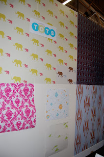
In addition to these grown up patterns, a line for Tempaper Tots is also available which includes the adorable Tusk and Currents patterns. Tempaper was founded in 2008 by set designers who were frustrated by not being able to find a repositionable wall covering. This was their solution which just so happens to be great for home decorating as well. This was their first NY Gift Show, and I have a feeling we'll be seeing a lot more of them in the future.

Tuesday, August 24, 2010

Scalamandre Fabric and More for Less!

For a few years now, I've been driving by this tiny shingled storefront called LooLoo Design in Portsmouth, RI and have always been intrigued by it. For one reason or another, I've never had the time to stop in, that is until this past Saturday. I had seen in their ads that they had discounted Scalamandre fabric, and while that sounded wonderful, I assumed that discounted Scalamandre fabric would still easily be in the $50-75 range per yard.
Well, I was wrong! Sometimes I love it when I'm wrong. LooLoo Design goes directly to the Scalamandre warehouse to select the fabrics they sell. While some of them are only sold by the bolt, the prices are still fabulous. I believe I saw some bolts of maybe 7-10 yards for around $140, which is closer to what the price of Scalamandre fabric retails for 1 yard.
They also have fabric squares that sell for about $7-10. Fabulous for a small project.
And there are plenty of trims to go along with it all.
I loved this large square of crewel (which I adore) fabric. It was $50. I was trying to figure out if you could cut it to make pillows and still see enough of the design, but then I decided that the best thing to do with it would be to make an oversized square ottoman and upholster the top with it. That would be amazing!
Here are some of the bolts and bolts of fabric that you can purchase by the yard, mostly in the range of $18-30/yard.
More bolts.
This Turquoise Linen was just about the most beautiful thing I've seen. I bet this would make great curtains for my bedroom with that new headboard I just finished.
Red vases on black would make a great wingback chair or drapes or I would even be tempted to upholster a wall in this.

This strawberry fabric has just the right touch of vintage in it.
LooLoo Design also has drapery panels that once hung in the Scalamandre showrooms. Because they were sample panels, most of them are singles, but there were a few in there that had multiples. For $35 a piece, sometimes you can make anything work. If you only have one window in a room, a single panel pulled back with a great tieback is all you need. I actually almost bought one for my daughter's room, but decided the colors weren't quite right.
It's hard to believe, but LooLoo Design actually considers their main business to be vintage bath fixtures. In fact if you go to their web site, that is pretty much all you'll find. Despite the fact that most of the walls are lined with fabrics and wallpaper (I found amazing wallpaper for the 18th Century Colonial Renovation we've been following), they do have some fabulous fixtures as well, like this swan neck faucet.
They also have some great antique frames and artwork. The above frame would be great to frame out some chalkboard paint if you didn't have a piece that needed framing.
More bath fixtures.
Brackets for shelving, including some really unique shapes.
They also have lots of vintage lighting fixtures ranging from modern to very traditional.
I loved these knobs.
These are vintage birthday candle holders. How cute are they! I think these would be an amazing christening or baby gift.
Vintage hand held vanity mirrors
Large spools of thread from the Scalamandre warehouse.

In case you couldn't tell, I was pretty psyched that I found this place. I have many more pictures beyond this. The owner, Jill, told me that a lot of designers try to keep it to themselves so that other designers won't find out about it. And I have to admit that the thought crossed my mind, but my feeling is that it's important to promote businesses that provide great products and services, especially in this economy. I want them to be around for a long time and so I want to encourage people to go there to make sure that they stay in business and keep offering these goods for both the benefit of myself and others so I'm letting the cat out of the bag and hopefully those other designers will inderstand why.

Friday, August 20, 2010

New York Gift Show Roundup: Jonathan Adler

I couldn't have been any happier than to see the Jonathan Adler booth meet me at the top of the first escalator I went up as I entered the New York International Gift Fair on Monday. If I haven't made it clear before, I am OBSESSED with his products. His designs are the epitome of smile inducing objects. They are just the perfect mix of preppy, modern, and fun. I don't know if I am suddenly loving turquoise because it's the Pantone color of the year, but the Mrs. Godfrey Chair (above) is awesome and comes with an equally fabulous name. I'm also totally digging the Talitha Rug under it.
I love the combination of the chunky wood and lucite in the Bond Collection Tables. And the gold side tables are an amazing piece of functional art.
One of my favorite Jonathan Adler pieces are his fish platters, but I think all of his tableware adds a nice splash of color to every day.
Hollywood Lamps, British Flag and Anchor Rugs, and pillows galore. Yes please!
I love a splash of fucshia lacquer mixed in with all the white. And the Ropes Wallpaper will make its way into my house some day.
The only thing that could be better than his products, are his products in miniature. The Jonathan Adler Junior Collection is to DIE for. I seriously can't decide what my favorite piece is, but I'm pretty fond of both the Junior Lampert Sofa and the ultra chic Junior Templeton Chair.
I'm also really keen on the Anchor Blanket, Zebra Rugs, and those adorable animal puzzles on the shelf. The Dinosaur Lamp is also in the running to replace the Giraffe Lamp as my favorite. I could probably change the name of this blog to the "Jonathan Adler's Biggest Fan Blog" so I better stop now before I go too far!

New York Gift Show Roundup: John Robshaw

John Robshaw's beautiful Indian inspired linens and pillows were lovely as always at the New York International Gift Fair. And while I'm a big fan of his bedding, my favorite items in the booth were his floor pillows.
These oversized pillows are a great alternative to the old beanbag chairs that kids love because they are both way more attractive and refined while still being comfortable.
They would be great in a teen's bedroom or a kids playroom or even to grab for outside as extra seating. Comfortable and chic!

Wednesday, August 18, 2010

New York Gift Show Roundup: Lighting

I had the wonderful pleasure of leaving my children and spending 24 hours in New York by myself so that I could attend the New York International Gift Fair on Monday. I have been to the gift show as an exhibitor, a buyer, and now as press. Most people are very overwhelmed by it because it is really soooo much stuff, and so very much of it is-shall we say- less than desirable. But one must cruise the entire show at the Javitz Center and Piers 92 and 94 to make sure that there isn't something new and fabulous that has popped up this round. It's also always fun to see who is there, and while it's my dream to catch Jonathan Adler while in his booth (yes, he does stop by), I would probably freeze and not know what to say to him. This time around I happened to pass by the Barefoot Contessa, Ina Garten (that woman could not create a bad tasting recipe if she tried) at the Stonewall Kitchen booth, and got to rub shoulders with Tory Burch at the John Robshaw booth which was pretty exciting.
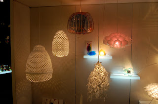
Anyhow, while there was lots and lots to see, and I have many posts to share on the NYIGF, when going back through my pictures, I realized I was clearly drawn to all the lighting. Ceiling pendants, lamps, chandeliers, you name it, if a required a light bulb, I seemed to have it covered. At the Jamie Young booth (top), I fell in love with the navy ikat lamp shade and the cream linen drum pendant with monotone stripes, among other things.
You may recall the Jill Rosenwald vases that I wrote about a few weeks ago. Well, the above two images are of her lamps which are to DIE for! I am going to start saving my pennies now for one (or two, or maybe even three) of these. Jill was so nice to talk to and I'm super excited to let you all know that sometime in the coming months we'll be doing a special Jill Rosenwald offer just for Chateau & Bungalow readers!!!
These Juliska Harriet globe pendants caught my eye at Lou Lou's Decor in Portsmouth, RI a few weeks ago so I was happy to see them again here. They would look so amazing anywhere from an entryway to a kitchen.
A good friend recommended I check out Lazy Susan, and they certainly didn't disappoint. While I have a lot of things to show you from that booth, here are the lighting highlights. The silver cylinder pendants (above) are sleek but versatile enough to fit into a more traditional home.
The petal pendants don't cast a lot of light, but they would be great in a cozy dining nook.
Also, by Lazy Susan, this great oval ring pendant light. I love this style because it reminds me of a modern take on the traditional "club" decor found in places like Bailey's Beach Club in Newport, RI and the Gasparilla Inn in Boca Grande, FL where you aren't sure if the decor has been pristinely cared for since the 50s and 60s or completely overhauled in the past year. This pendant is like wicker with a twist.
Another fabulous lighting booth was Stray Dog Designs who does a lot of their work in paper mache. They also use lots of bright colors which I love. The oversized drum pendant (above) stopped me in my tracks.
Yes, even this artichoke inspired lamp is made of paper mache!
And the shades here are made of repurposed maps. I love the glass finial on that green lamp too.
Another longtime favorite is Artecnica. They always have the most inventive pieces, and this show was no different. If you're looking for a truly unique conversation piece, chance are you'll find it at Artecnica.

I could literally go on forever on the lighting, but tomorrow we'll cover something else. Lots more to come!