My blog has moved!
You should be automatically redirected in 5 seconds. If not, visit redirectLink" href='http://chateauandbungalow.wordpress.com/'> http://chateauandbungalow.wordpress.com and update your bookmarks.


Monday, March 28, 2011

Kids Birthday Party

On Saturday, my daughter Carolina had a joint birthday party with her best friend for their 2nd birthday. They are nine days apart so it was perfect. It was also perfect that her friend's mother shares my neurosis for details which I knew in advance, but which really came to light when the two of us were testing every pen in Michael's Craft Store trying to get just the right color ink to match the invitations I had designed (using a free graphic design program called Inkscape). I knew I had found someone I could really work with! We went with a simple theme of pink and purple as my daughter is always in pink and her's is in purple, and we threw in a little green to tie things together where we needed to.
Of course, I had to make tissue paper pom poms (well actually, the pink and green ones were the same as the ones I used last year that now hang in my daughter's room when party time is over) to hide my hideous ceiling fans and add a little ambiance. This was the first time I made them with a patterned paper and I think the floral ones actually came out really cute.
The table screamed spring! I love having my daughter's birthday in the spring. There is so much appropriate decor out there to incorporate into a little girl's party this time of year. And at the last minute we decided to use some cute mini cupcake wrappers as individual ketchup servings for the kids which really added a great visual element to our serving platters too.
There are few things I love more than a good monogram! I came up with this one using the first initial of each of the girls' names, and had originally planned to use it on the invite, but at the last minute before going to print realized that we were doing it for us and it didn't really scream 2 year old so I did a quick change with a cupcake. But we had to get it in somewhere so we made it into cupcake picks...
and put a 2 on the opposite side. Of course we had to have pink and purple cupcake wrappers and pink and purple sprinkles to match. And I am now obsessed with having the proper tools to frost and decorate cakes and cupcakes. The Wilton Cupcake Decorating Set provides four tips, icing bags, and directions (if you are so inclined to read such things) on how to do different styles so you can create more professional looking sweets on your own. Go get one if you ever frost your own baked goods.

Displaying the 5 dozen cupcakes on different serving pieces of various shapes and heights made for a more interesting visual display.
A little garden of Peep pops (lollipop stick inserted into Peep-couldn't be easier) just for fun.

And for the favors, we found pink and purple tins that we filled with giblets, wrapped in green grosgrain, and sealed with our monogram label. None of these things were particularly difficult to do. In fact on a scale of 1 to 10 with 10 being the hardest, I'd put them at about a 4. With a little creativity and a few extra dollars (but not many), you can create a truly customized kids birthday party with a big impact without blowing the budget.

Thursday, March 24, 2011

Be Prepared for Warm Weather

A few inches of snow on the ground isn't going to get me down. I've got pansies planted in my window boxes and spring is still here, with summer not too far away either. Rather than dwell on the snow, I'm going to look at the things I'd like to fill my outdoor spaces with. Here are a few of my favorites starting with the Fairfield Square Planter from Gardener's Supply. Use it on your steps, your patio or scattered about your yard with flowers or vegetables.
There are few things more relaxing than lounging in an Adirondack Chair, like this one from L.L. Bean. Add wine for perfection.
There are few things more enjoyable in the summer than dining al fresco, but you'll need to shed a little light on your meal with these Square Glass Lanterns from Wisteria.
These fabulous Esther Paisley Outdoor Cubes by Pottery Barn will work wonderfully as both extra seating and as a table where you can rest your snacks.
And of course there must be games! I love this Lawn Bowling Set from Restoration Hardware. Now go get yourself some of these outdoor gems, and by the time they arrive on your doorstep, I bet mother nature will be ready for you to use them. And until then, I think you'll have an added spring in your step!

Wednesday, March 23, 2011

Parentables is Now Live!


Hello neglected blog readers! I wish I could say I've been neglecting the Chateau & Bungalow blog because I was lounging somewhere on a sunny beach, but alas I've been doing something much less glamorous, although equally as exciting in many ways. You may recall my mentioning that I was going to be writing for TLC's new blog Parentables. Well, we are officially live! I really encourage any of you who are parents, ever want to be parents or just plain wonder what all the fuss is about to check it out. Because it's an all encompassing blog there are posts on just about every topic under the sun from fashion and food to discipline and health, and of course great design and products for kids. In design-land I've done posts on the coolest cribs, baby gear that will accent your decor instead of being an eyesore, and some super creative ways to display your children's art work. Please check them out! Other topics that I've covered include teaching kids about healthy body image, my son's diagnosis of Pyloric Stenosis, Rent the Runway, how to save big bucks at the grocery store, and more. Become a Facebook fan of Parentables here to follow all the latest stories. And now that I'm getting into the swing of things, C & B's regular posts will be back on schedule. I've got my daughter's 2nd birthday party this weekend with a full array of fun party decor ideas to share. Remember her 1st birthday? There's a lot more where that came from!

Wednesday, March 9, 2011

DIY Chalkboard Easel From Old Crib

There are few things that make me happier than seeing something transformed from it's no longer useful self into a completely new and fabulous product. Katie from Notes From a Very Red Kitchen has really killed it with this one, particularly because there are thousands and thousands of cribs out there that are no longer deemed safe because they have drop sides, my daughter's included. Katie has taken an old crib and transformed it into a two sided easel and chalkboard, something that just about every kid enjoys. Not only is it a great re-purposing of a no longer useful item, but it's actually better looking than most kids easels on the market too. Bravo! You can create your very own by following her detailed crib to easel directions and pictorial.

Image via
Notes From a Very Red Kitchen

Monday, March 7, 2011

Spring is Coming! Create a Garden Journal

The beginning of March in New England. It is a typically dreary time when people start to really moan. At least in coastal RI, the snow is usually behind us by this point, but any sort of color in our lives seems very far off. The trees, the grass, and the roads make for a very gray world this time of year. Sunday morning I was watching the news and the weather forecast for pouring rain beginning at noon through Tuesday morning (luckily they were wrong). The thought of another day stuck inside the house was killing me. So I went upstairs and ordered all members of my family to get dressed and get outside before the rain started and while the sun was still shining. What started as a plan for a simple yard clean up and some fresh air turned into a rejuvenation process. As we started to peel back the layers of winter brush, leaves and muck, we found unexpected new life on our plants. The first to catch my eye was this hydrangea shoot starting to take off and its many friends nearby.
Next up the pussy willow tree where I found buds starting to break open in all their white fuzziness.
In just a few weeks, these deep purple buds will be beautiful lilacs.
I was expecting to find my daffodils starting to sprout, but the lillies not so much. Oh my! Look at all the lillies heading my way.
The tall green shoots are the daffodils. I clearly need to plant more.
That little bit of green in the above picture is the start of my irises. These guys were huge and abundant last year, and they bloom on the early side of the season so it won't be too long before we see them.

The start of my poppy. I bought this poppy in the spring of last year because I was looking for things that bloomed early. Unfortunately, the bunnies got to the bud before we saw any flower, and I still need to figure out had to keep my rabbit friends out of this garden this year.
I was not expecting to see the Dianthus I planted last year come back, but apparently I got the Sweet William variety that are perennials. Yay! Or maybe only some will come back. That's what is so fun about gardening. You never really know what you're going to get. Every year I say I'm going to start a garden journal to keep track of what I've planted and how things have done, and every year I don't do it. This will be our fourth summer in our house and it's time I get on it as I'm constantly adding new things and moving things. I know myself well enough to know that I'm not likely to sit down and jot down notes about each plant, but I love to take photos of the garden so this is the beginning of my 2011 Garden Images Journal. The pictures will be a good reminder of years past and I'm going to vow to look back at them at the beginning of each year to remind myself that spring truly is just around the corner. After two hours of clearing yesterday, I can now see it out my kitchen window as fresh green shoots are starting to sprout up. With daylight savings happening this weekend, I have big plans to be spending my evenings in the garden starting next week. As you can see from the pictures, I have a lot of weeding to do!

Friday, March 4, 2011

Lulu DK Spring/Summer Collection

Right now I'd like to sail away on one of these boats featuring the new Lulu DK Sunburst fabric. Love! The miracle of Photoshop brings two of my favorite things together, being on the water and design.
Here's a look at the Sunburst fabric up close. What I love so much about Lulu DK is that they always nail the colors so well. I just want to soak them all up.
The Colors fabric reminds me of my seaglass collection that I've been gathering on the shores of our beach house since I was a toddler. This would make a great roman shade or shower curtain in a bathroom or draperies in a bedroom.
And not to be forgotten, the new collection of Lulu DK wallpaper is equally as fabulous. I love this coral and shell themed Sunshine wallpaper. Check out the complete collection at www.luludk.com.

Thursday, March 3, 2011

Etsy Pick of the Week: Circa Ceramics

Thank you to Jerry James Stone for the tip on Circa Ceramics, a fabulous Etsy store featuring colorful ceramic ware with pop graphics.
Each piece, which range from mugs, bowls and plates to necklaces, magnets, and mini tiles, is available in 12 colors (reminiscent of fiestaware) and more than two dozen graphics so you can create exactly the look you want.
The options for graphics include my favorite, the whale (top), as well as a full range of hobby themes and other popular icons such as the VW bus and bug, a sewing machine, a rolling pin, a camera, a bike, an owl and so much more.

I hope The Pioneer Woman has this spoonrest. Ah, the spoonrest! Whatever happened to it? I feel like nobody every has them in their homes anymore, but they are such a useful item, and when you can have one this as good looking as the ones Circa Ceramics offers, you should really have one.

These ceramics have a decidedly retro feel and would obviously look amazing in a retro kitchen, but individual pieces make great personal gifts and show people you were really thinking of them. And it's also always a huge benefit to be able to customize your pieces. How often do you find something you love, but the color is all wrong?! So hop on over to Circa Ceramics and start creating your very own piece. As each item is custom made, delivery takes three weeks. Waste no time!

Wednesday, March 2, 2011

Budget Friendly Kitchen Remodel

I was browsing through pictures on my computer last night and came across some photos from our old condo which was pre-blog, but I thought our kitchen re-model in this place was worth showing you because it was a tiny outdated space that we re-modeled on a pretty small budget (at least as far as kitchen renovations go). I don't have a before photo to show you, but imagine 1980s standard issue laminate cabinets like these paired with laminate flooring and countertops and beige appliances. We lived just a few blocks from the beach and it wasn't quite the look that suited our neighborhood or lifestyle, but with just a few facelifts, we created an entirely different space.
First off, those are the same cabinets! We removed the doors, painted the interior and exterior of the cabinets and then had a woodworker friend make new door fronts, some with beadboard and some with glass. We removed the bottom end cabinet to create a custom bar area that would hold the wine fridge we received as a wedding gift and store wine bottles. If you look closely you can see a cutting board that pulls out above the wine fridge that we could use for bar fruit. Plus, we were able to use the end space to add a bookcase for all my cookbooks.
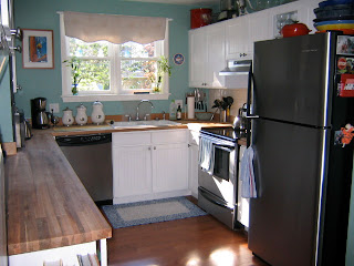
We also replaced the counter tops with butcher block and swapped out the appliances for stainless steel. My husband and brother in law replaced the laminate and wall to wall carpet floors throughout the entire first floor with a pre-finished hardwood. A few other small space ideas that we did were to paint the narrow strip of dark wood between the upper left cabinets that no longer matched the kitchen with chalkboard paint, add glass storage (because I have an obsession with glassware) underneath the cabinets with a hanging rack, add the pull out cutting board, and maximize the storage above the cabinets by keeping items we didn't use as often up there as well as buying matching baskets to put up there that contained things like dining room linens.
It's amazing what a difference a few changes make, and how much you can change the feel of an entire house by making changes in a single room (although I of course kept on going). If you are living with a room that you really can't stand, but think you don't have the money to change it, try to think of creative ways to re-create the space. If your cabinets are paintable you can do just about anything you want with them to create and entirely new space.

Tuesday, March 1, 2011

The Difference Between Men & Women and Design

I'm probably going to get in trouble for this, but I have to do it. First, let me say that I love my husband dearly, and he is an incredible father and is quite handy around the house. It seems nearly impossible to get anything accomplished in my daughter's room because she is always in the middle of everything, and the only time to get anything done is when she is asleep...in her room. So when the kids and I went away last week, I figured it was the perfect time to have my husband hang the light fixture I had purchased from Ikea months ago. To make a long story short, parts were missing for the shade and now there is a light-bulb dangling from a cord in the corner of her room. I'm sure I should have no safety concerns about that, but there was not a lot he could do to fix that issue at the time, and he did make an attempt with another shade that just wouldn't hang straight.
In any event, he also took the time to hang the new smoke detectors he had bought for the kids' rooms as it was making him nervous that we didn't have one in each room. As I said, great dad! BUT, what I can't figure out is why he chose to hang them in the center of the wall which is a drastically different color and near artwork (the adorable Beatrix Potter needlepoint that my mom made and that hung in my room for my entire childhood). Utilitarian objects like this are necessary, but the object is to make them "disappear". There is a white ceiling where it would have blended right in. If it needed to be on the wall instead of the ceiling, perhaps behind the door to her room where nobody really looks would have worked or on the also painted white door that accesses the attic space. But nope, he chose right smack dab in the middle of the biggest open wall in her room.
It just makes me wonder about how the minds of men and women work so differently. The utilitarian vs. aesthetic way of approaching things. I feel bad telling my hubby (so why not just tell the world in a blog post instead) because I know he always has the best intentions, but I can't live with it. Not that I want to give up my daughter's safety, but just keep her safe without the safety devices being so in your face. Would it be wrong to create a book of guidelines that need to be followed when placing things around the house? I think that makes me sound like a crazy you-know-what, but it's the little things like this that drive me bonkers every time I walk into a room, and I know that we just see things differently so I'd actually be doing him a favor by letting him know up front rather than having him constantly move things, right?